20 November 2009
EVALUATION 1. In what ways does your media product use, develop or challenge forms and conventions of real media products ?
EVALUATION 2. How effective is the combination of your main product and ancillary texts?
SCRIPT
Matt - Hi I'm Matt.
Tara - And I'm Tara,
'
Matt - And this is the music video we made for the band Feeder, called Feeling a Moment. The song is taken from their debut album 'Pushing the Senses'.
Tara - Feeder are a band based in the UK, and are quite popular among 15 to 25 year olds. Their music is an indie genre.
Matt - For our band’s image, we wanted to create an indie style music video with the characteristics of an indie video, including certain camera shots, angles and so on.
Tara - This involved research into indie genre music videos and camera angles used, such as close ups of the main singer, shots of instruments, and long shots of the band. We wanted to portray the main singer of the main member of the band, with the most camera angles as opposed to the other band members.
Matt - We had a clear and simple narrative, which we blended with the overlay effect in Final Cut after some feedback. The narrative is of a couple together, and is linked to the lyrics. Our feedback was that it didn't blend too well, so we overlayed the main singer over the top if this footage in Final Cut, which made it appear like the footage was in his thoughts or memories, and we think this blended a lot better.
Tara - I had a band and a singer from the early planning stages, so this really helped in terms of getting a band together for the song, we were really pleased with all the effort put in by each band member, such as learning lyrics and chords - and think this really helped them in terms of performance.
DROP DIGIPAK IN
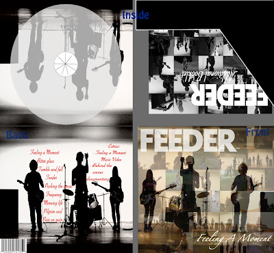
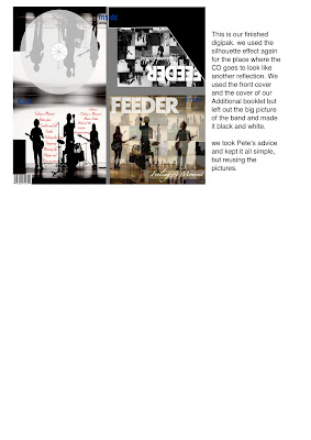
Tara - Our digipak and magazine advert are also based on our music video, also hoping to create an indie genre music cover for our album after researching 'indie genre' album covers.
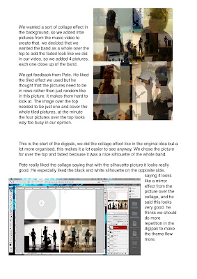
Matt - We created a collage of pictures in Photoshop, and used four seperate images of each member of the band, and to show them as the main images, we made them darker than the collage in the background.
Tara - For our additional information, we decided to add an additional booklet and a behind the scenes documentary, as well as the music video for 'Feeling a Moment'.
DROP MAGAZINE ADVERT IN
Tara - For the magazine advert, I did some planning at home, and liked the look of a few templates on Pages so tried these out as practice.
Matt - After looking at magazine adverts, I created 3D CD digipak album covers in After Effects and thought it would be a good idea to use these on the Magazine advert.
Tara - I created two magazine adverts originally, and after researching adverts on the blog, I chose the first one I did which featured a beige background and prominent layout.
Matt - The magazine advert and digipak showed clear links to our music video in terms of visual style and indie genre album covers and mag adverts.
OVERALL...
Tara - Overall, we felt that we achieved what we aimed to, and matched the characteristics, camera angles, and shots of an indie genre music video really well based on our research.
Matt - We think that we promoted the band effectively with the digipak and magazine advert, and we think the music video we made gave the band the correct image that a record company would want to put across.
VOICEOVER AND VIDEO TO BE ADDED FRIDAY.
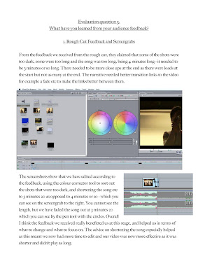
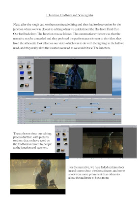
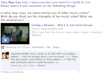
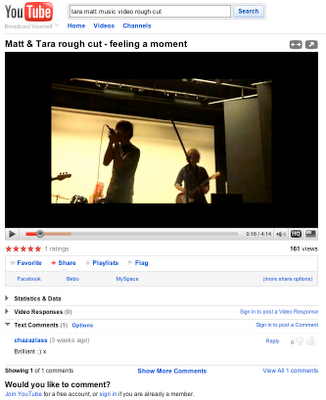
EVALUATION 3. What have you learned from your audience feedback?

18 November 2009
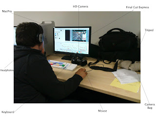
EVALUATION 4.How did you use new media technologies in the construction and research, planning and evaluation stages?

12 November 2009
Magazine Articles
11 November 2009
10 November 2009
More Editing of the digipak
Magazine Articles for digipaks
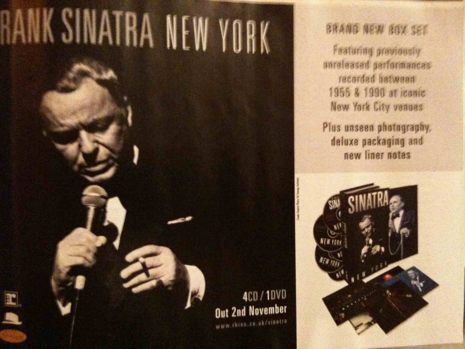
This advert is for a frank sinatra or rank sinatra as it says in the pictures new album, or old now as it was out millions of years ago.
this advert is quite basic as it only shows the digipak with some text and a massive picture of Frank, and it explains what is in the album with special features.
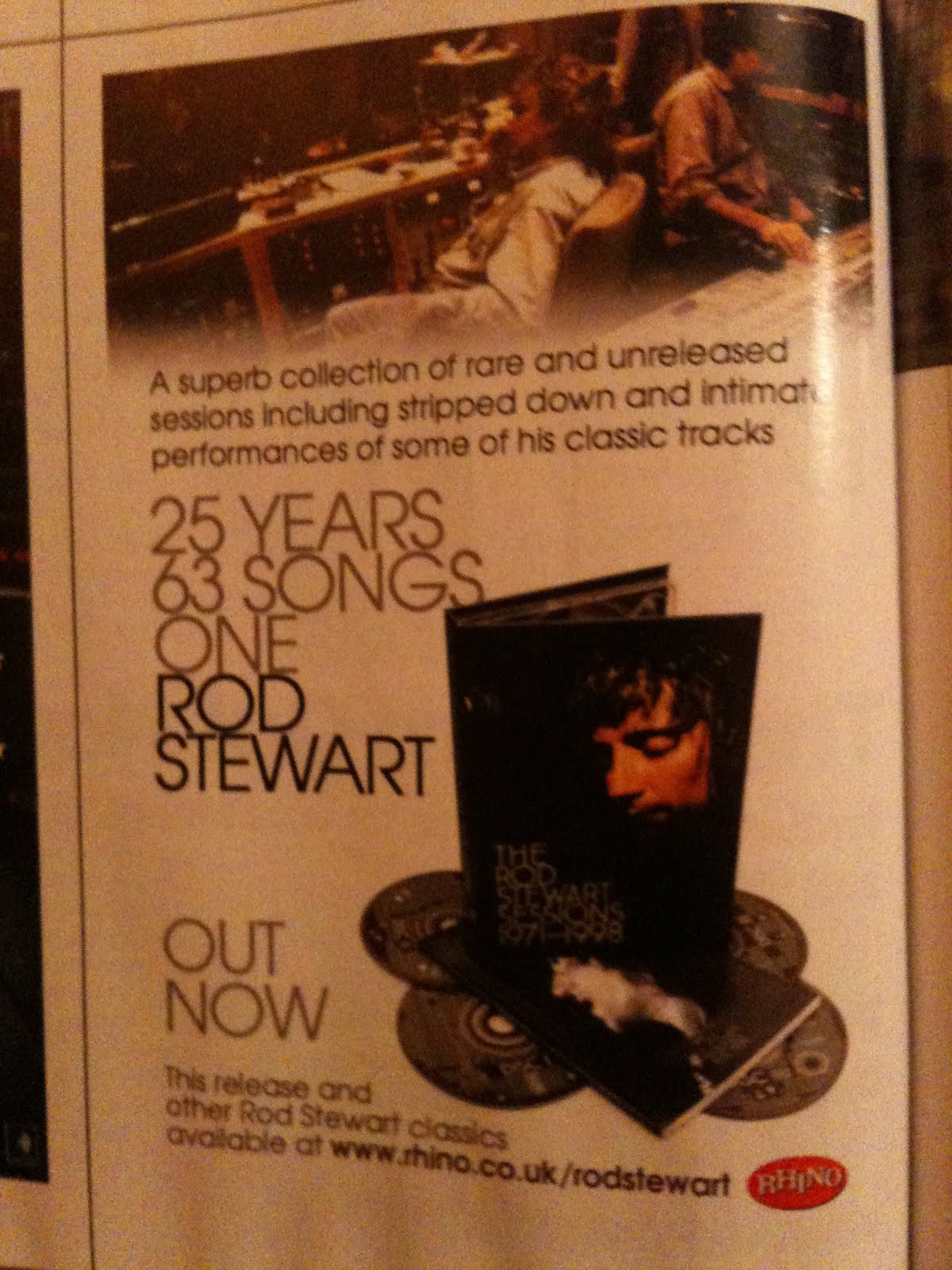
This magazine advert is similar to the Frank Sinatra Advert because it is just a simple image with with just text advertising his album, which features the digipak, it attracts audiences of Rod Stewart.
09 November 2009
Research on Digipaks
For this one its quite a plain image, but its not boring, this is quite similar to what we want as we want a plain design but have it mean something like this has.
For this one they seem to have just taken a few images and placed them on the pack for emphasis, these photos either mean somthing, or are placed there to look pretty.
CD Cover Progress
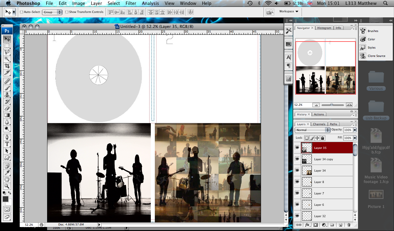
Today i started work on the Digipack, this was our orgional idea to have a tiled effect for the background of the main cover and use the overlay effect like in our video to show the whole band silhouette, i think this works effetcive, all we have to do now is add some text and think about what we are going to add on the inside

Breif Research on Digipak.
Digipaks typically consist of a gatefold (book-style) paperboard or card stock outer binding, with one or more plastic trays capable of holding a CD or DVD attached to the inside. Since Digipaks were among the first alternatives to jewel cases to be used by major record companies, and because there is no other common name for Digipak-style packaging made by other companies, the term digipak or Digi-Pak is often used generically, even when the media holder is a hub or "Soft Spot Digipak-style packaging is often used for CD singles or special editions of CD albums and the tall DVD Digipak (DVDigipak) is used as a premium package for DVDs and DVD sets.
Because such packaging is less resistant to abrasion than jewel cases, it tends to show signs of wear relatively quickly. Licensed digipak manufacturers such as domestic U.S. printer and disc replicator Oasis Disc Manufacturing recommend coating the raw printed paper with a protective UV coating
Screenshots of editing
More feedback from Pete
06 November 2009
DVD Digipak
Feedback From Junction
They first said that they really liked the silhouette effects that we had going on, even though the screen was ALOT darker then what i am usually used to seeing, it actually was very effective, and they thought that was the strongest part of the video, even though you couldn't really see the singer
Secondly they thought that the Narrative stuff filmed outside was a little weak, and didn't come off as effective enough and they suggested cutting it out, i personally do not want to do this as then all it will be is a video of a band playing, not nessaserly a music video, maybe there can be a way to slot them in effectively.
They really liked the space we used, saying it was not all the same as everyone elses and that made it unique, large space and a great place to film.
At the end Simon stated that everyones music video was at a high quality end, and said that he may show the finished products to other places if given the permission.
04 November 2009
More editing
Feedback on the roughcut
21 October 2009
Editing the Rough Cut
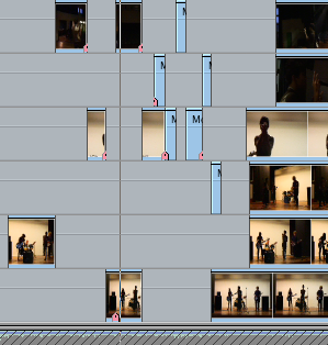

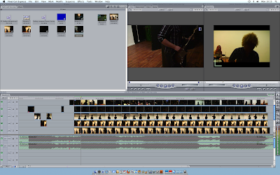
We had many different camera angles of the whole song, so we synced them up to the music eat in turn so it will be easyer to edit them later because they are already all lined up, these where taken during the editing of our rough cut as you can see, all the footage is still pretty much there.
